Exploring the Gapminder data set
Gapminder revisited
We are studying the Gapminder data set to analyse how HIV and life expectancy affect different countries. We will also study the relationship between the two variables to analyse whether one impacts the other.
# load gapminder HIV data
hiv <- read_csv(here::here("data","adults_with_hiv_percent_age_15_49.csv"))

life_expectancy <- read_csv(here::here("data","life_expectancy_years.csv"))
# life_expectancy <- my_data <- read.csv(file.choose('life_expectancy_years.csv'))

# get World bank data using wbstats
indicators <- c("SP.DYN.TFRT.IN","SE.PRM.NENR", "SH.DYN.MORT", "NY.GDP.PCAP.KD")


library(wbstats)

# Load worldbank data set
worldbank_data <- wb_data(country="countries_only",
                          indicator = indicators,
                          start_date = 1960,
                          end_date = 2016)

# Load countries data set
countries <-  wbstats::wb_cachelist$countries

# Create one column for all years, instead of one column for every individual year
hiv_cleaned <- pivot_longer(hiv, 2:34, names_to = "date", values_to = "hiv_prev")
life_exp_cleanead <- pivot_longer(life_expectancy, 2:302, names_to = "date", values_to = "life_exp")

# Rename columns for clarity
worldbank_data <- worldbank_data %>%
                  rename(GDP_percap = NY.GDP.PCAP.KD,
                         prim_school_enroll = SE.PRM.NENR,
                         mortality_rate = SH.DYN.MORT,
                         fertility_rate = SP.DYN.TFRT.IN)
What is the relationship between HIV prevalence and life expectancy?
# Relationship between HIV prevalence and life expectancy?
# Do inner_join because we only want to keep the observations for which we both have the hiv prevalence and the life expectancy
life_exp_hiv <- inner_join(life_exp_cleanead, hiv_cleaned) %>%
na.omit()
ggplot(life_exp_hiv, aes(x=hiv_prev, y=life_exp)) +
geom_point(alpha=0.15) +
labs(title="Initial increase of total HIV cases per 100 people sharply diminishes\nlife expectancy at birth",
subtitle="Relationship between HIV prevalence and life expectancy",
caption="Source: World Bank",
x="Number of HIV cases per 100 population aged 15-49",
y="Life expectancy at birth") +
geom_smooth() +
theme_bw() +
theme(plot.title = element_text(face = "bold", size = 10)) +
theme(plot.subtitle = element_text(size = 8)) +
theme(axis.title.x = element_text(face = "bold", size = 10)) +
theme(axis.title.y = element_text(face = "bold", size = 10)) +
theme(plot.caption = element_text(face = "bold", size = 8))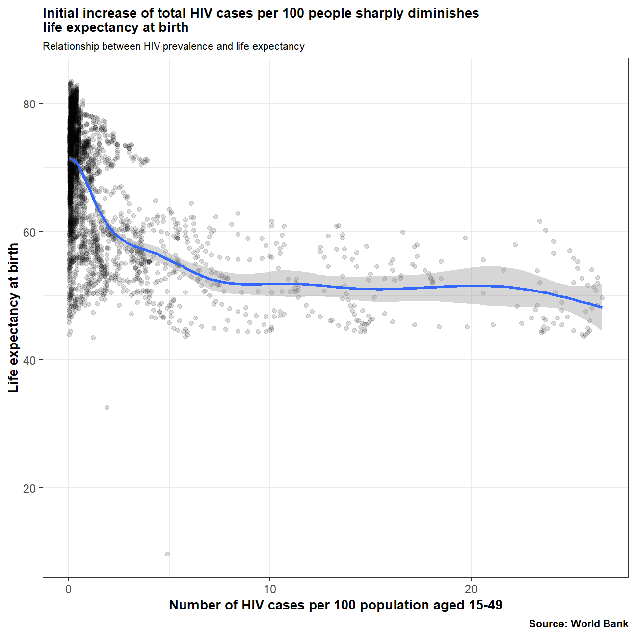 There is a clear correlation between life expectancy at birth and the number of HIV cases (per 100 people). Life expectancy is greater in countries with lower HIV prevalence.
What is the relationship between fertility rate and GDP per capita?
# Relationship between fertility rate and GDP per capita?
fertility_gdp <- select(worldbank_data, country, GDP_percap, fertility_rate)
#Generate a scatterplot with a smoothing line to report your results. You may find facetting by region useful
ggplot(fertility_gdp, aes(x=fertility_rate, y=GDP_percap)) +
geom_point(alpha=0.15) +
labs(title="Having fewer babies turns out to be a stimulating factor for the economy",
subtitle="Relationship between fertility rate and GDP per capita",
x="Fertility rate in number of babies per woman",
y="GDP per capita in constant 2010 US$",
caption="Source: World Bank") +
geom_smooth() +
theme_bw() +
theme(plot.title = element_text(face = "bold", size = 10)) +
theme(plot.subtitle = element_text(size = 8)) +
theme(axis.title.x = element_text(face = "bold", size = 10)) +
theme(axis.title.y = element_text(face = "bold", size = 10)) +
theme(plot.caption = element_text(face = "bold", size = 8))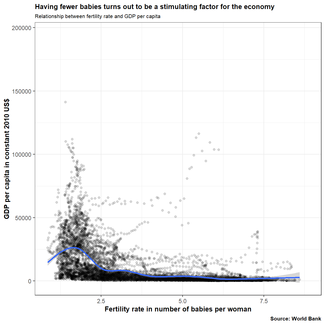 The graph shows that in countries where the average amount of babies is lower, GDP per capita appears to be higher. This could be due to mothers having less commitments to their children and the ability to work more than in countries with a higher fertility rate.
What regions have the most observations with missing HIV data?
# Which regions have the most observations with missing HIV data?
# Convert country names into iso3c country codes to match with other data frames
library(countrycode)
country_names <- hiv_cleaned$country
hiv_cleaned$iso3c <- countryname(country_names, 'iso3c')
countries_regions <- select(countries, iso3c, region)
# Match all region names to the hiv data set, keeping all values of the hiv data set
hiv_regions <- left_join(hiv_cleaned, countries_regions)
hiv_missing <- hiv_regions %>%
               filter(is.na(hiv_prev)) %>%
               group_by(region) %>%
               count() %>%
               arrange(desc(n))

#Generate a bar chart (`geom_col()`), in descending order.
# TO DO
ggplot(hiv_missing, aes(x= reorder(region, -n), y= n)) +
  geom_col(fill='#66bfbf', color="black") +
  labs (y='Amount of missing HIV data', x='Region',
        title='Where did the HIV data go?',
        subtitle ="Missing global HIV data by Region",
        caption ="Source: World Bank") +
  scale_x_discrete(guide = guide_axis(n.dodge=3)) +
  theme(plot.title = element_text(face = "bold", size = 10, margin=margin(b = 15))) +
  theme(plot.subtitle = element_text(size = 8)) +
  theme(axis.title.x = element_text(face = "bold", size = 10)) +
  theme(axis.title.y = element_text(face = "bold", size = 10)) +
  theme(plot.caption = element_text(face = "bold", size = 8))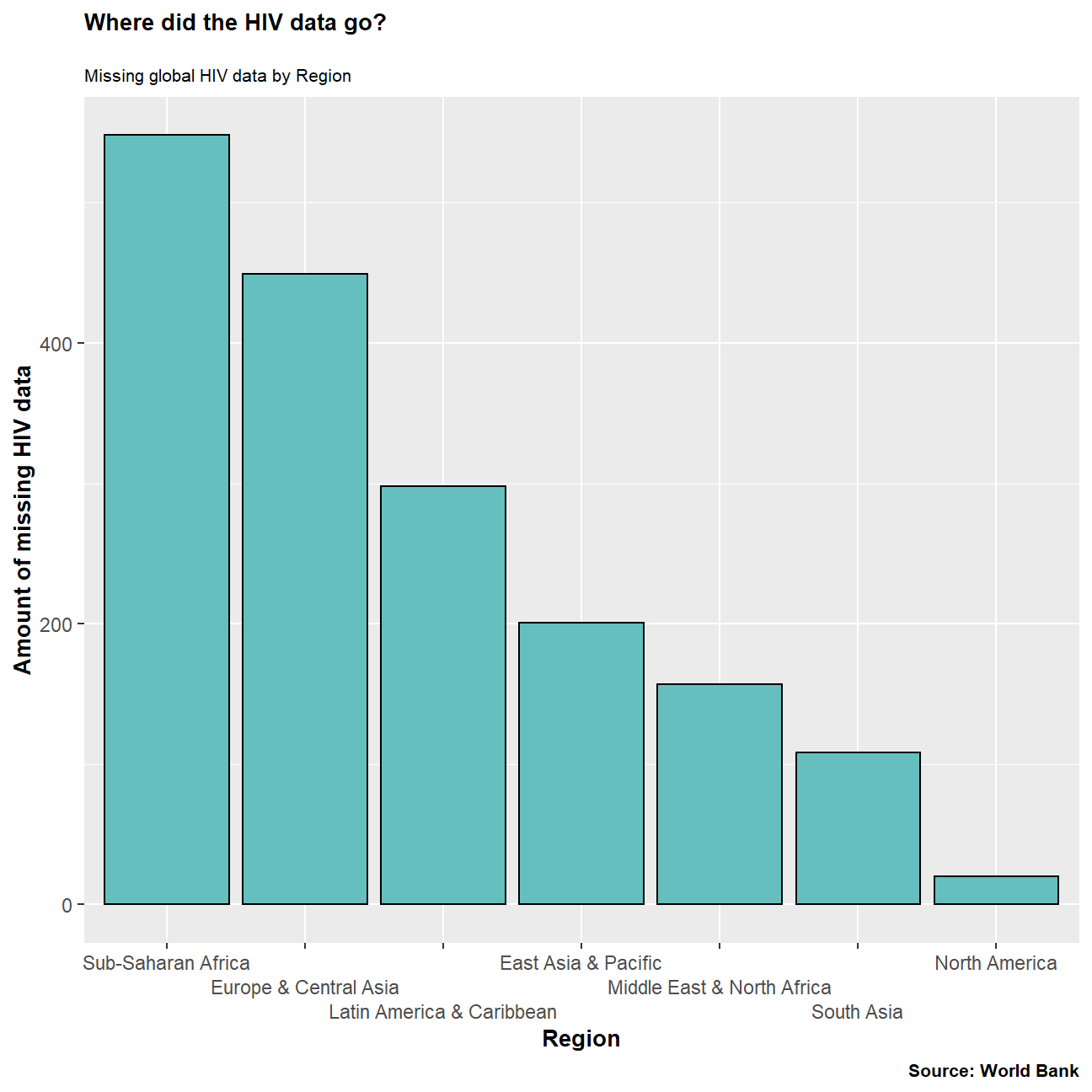
How has mortality rate for under 5 changed by region
The data on mortality rate was incomplete and therefore inconsistent. Analysing the entire period would have not been a fair comparison. Therefore, we decided to analyse the last 20 years for which the data was complete. This allowed us to accurately illustrate which countries had made the most or least improvement in mortality rates for under-5s.
# How has mortality rate for under 5 changed by region? In each region, find the top 5 countries that have seen the greatest improvement, as well as those 5 countries where mortality rates have had the least improvement or even deterioration.
mortality_rates <- select(worldbank_data, country, date, mortality_rate, iso3c)
mortality_regions <- left_join(mortality_rates, countries_regions)

# 1. Filter dataset on year = 1996 | year = 2016
# 2. Pivot wider making 1996 and 2016 two separate columns so we have one row in our data per country
# 3. Delete the rows with NAs (Explain this properly in our doc)
# 4. For the observations left, create new column = (year 2016 - year 1996) / year 1996
# 5. Select top 5 and bottom 5 per region and move these observations to a new dataframe
# 6. Plot this dataframe in a facet wrap graph and also produce a table of this data

#Plotting improvement over a 20-year period due to missing NA data and an unspecific task.
#Find the mortality difference from 1996 to 2016(most recent data)
country_mortality <- mortality_regions %>%
                     filter(date %in% c("1996", "2016")) %>%
                     pivot_wider(
                       names_from = "date",
                       values_from = "mortality_rate") %>%
                     rename(rate_2016 = "2016",
                            rate_1996 = "1996") %>%
                     mutate(mortality_change=(rate_1996-rate_2016))

#Find top 5 improvements per region
top_5_improvements <- country_mortality %>%
                      arrange(desc(mortality_change)) %>%
                      group_by(region) %>%
                      slice(1:5)

#Find bottom 5 improvements per region
bottom_5_improvements <- country_mortality %>%
                        arrange(mortality_change) %>%
                        group_by(region) %>%
                        slice(1:5)

# Plot Top 5 improvements per region
ggplot(top_5_improvements, aes(x=country, y=mortality_change)) +
       geom_col(fill='#66bfbf', color="black") +
       labs(title="Africa making strides in mortality rates under 5",
       subtitle="Most improved mortality rate countries by region",
       caption="Source: World Bank",
       x="Country",
       y="Amount improved (per 1000 live births)") +
       facet_wrap(~ region, scales = "free_x") +
       theme_bw() +
       scale_y_log10() +
       theme(plot.title = element_text(face = "bold", size = 10)) +
       theme(plot.subtitle = element_text(size = 8)) +
       theme(axis.title.x = element_text(face = "bold", size = 10)) +
       theme(axis.title.y = element_text(face = "bold", size = 10)) +
       theme(axis.text.x = element_text(angle = 270, hjust = .1)) +
       theme(plot.caption = element_text(face = "bold", size = 8))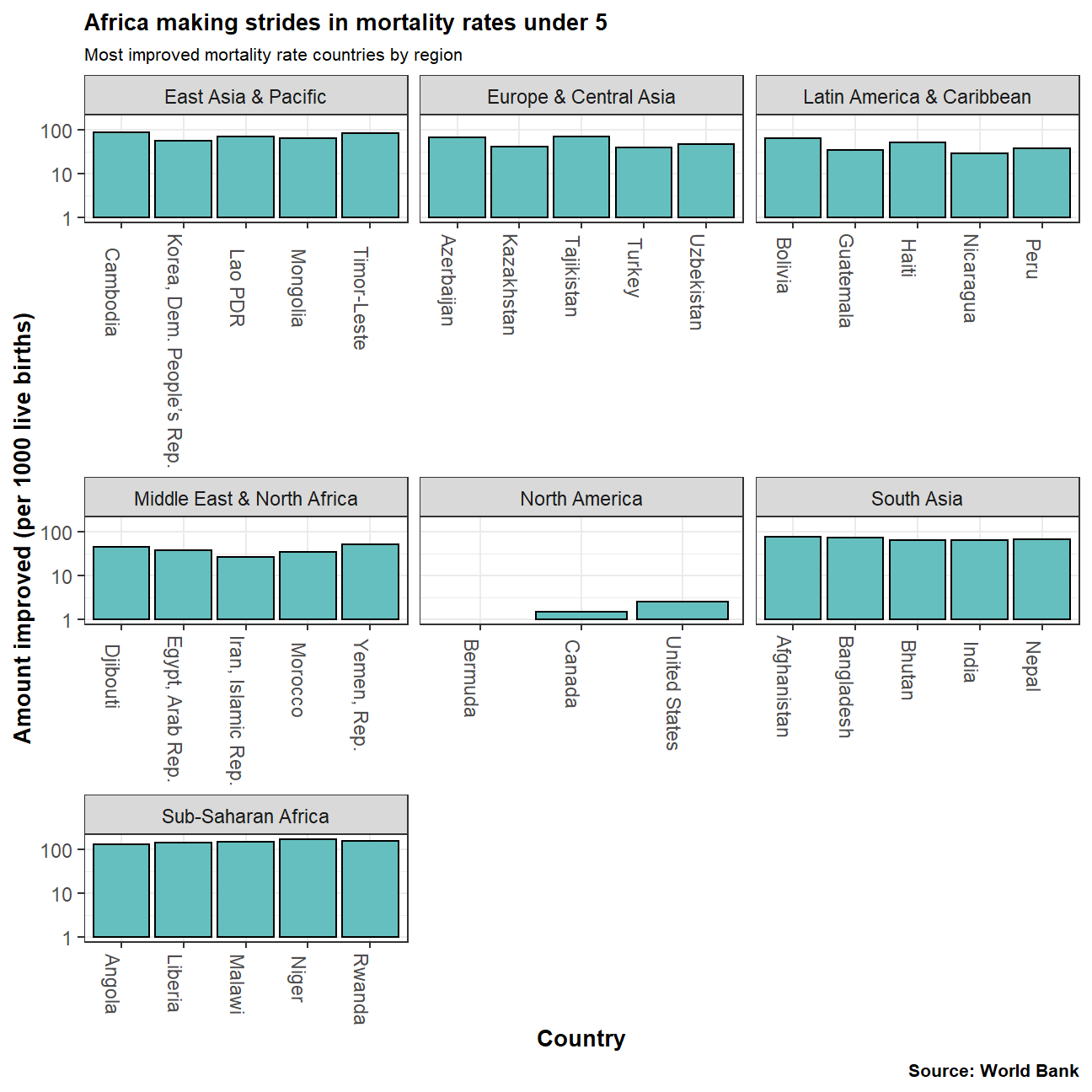
# Plot Bottom 5 improvements per region
ggplot(bottom_5_improvements, aes(x=country, y=mortality_change)) +
       geom_col(fill='#66bfbf', color="black") +
       labs(title="Least improved mortality rate countries by region",
       caption="Source: World Bank",
       x="Country",
       y="Amount improved (per 1000 live births)") +
       facet_wrap(~ region, scales = "free_x") +
       scale_y_log10() +
       theme_bw() +
       theme(plot.title = element_text(face = "bold", size = 10)) +
       theme(plot.subtitle = element_text(size = 8)) +
       theme(axis.title.x = element_text(face = "bold", size = 10)) +
       theme(axis.title.y = element_text(face = "bold", size = 10)) +
       theme(axis.text.x = element_text(angle = 270, hjust = .4)) +
       theme(plot.caption = element_text(face = "bold", size = 8))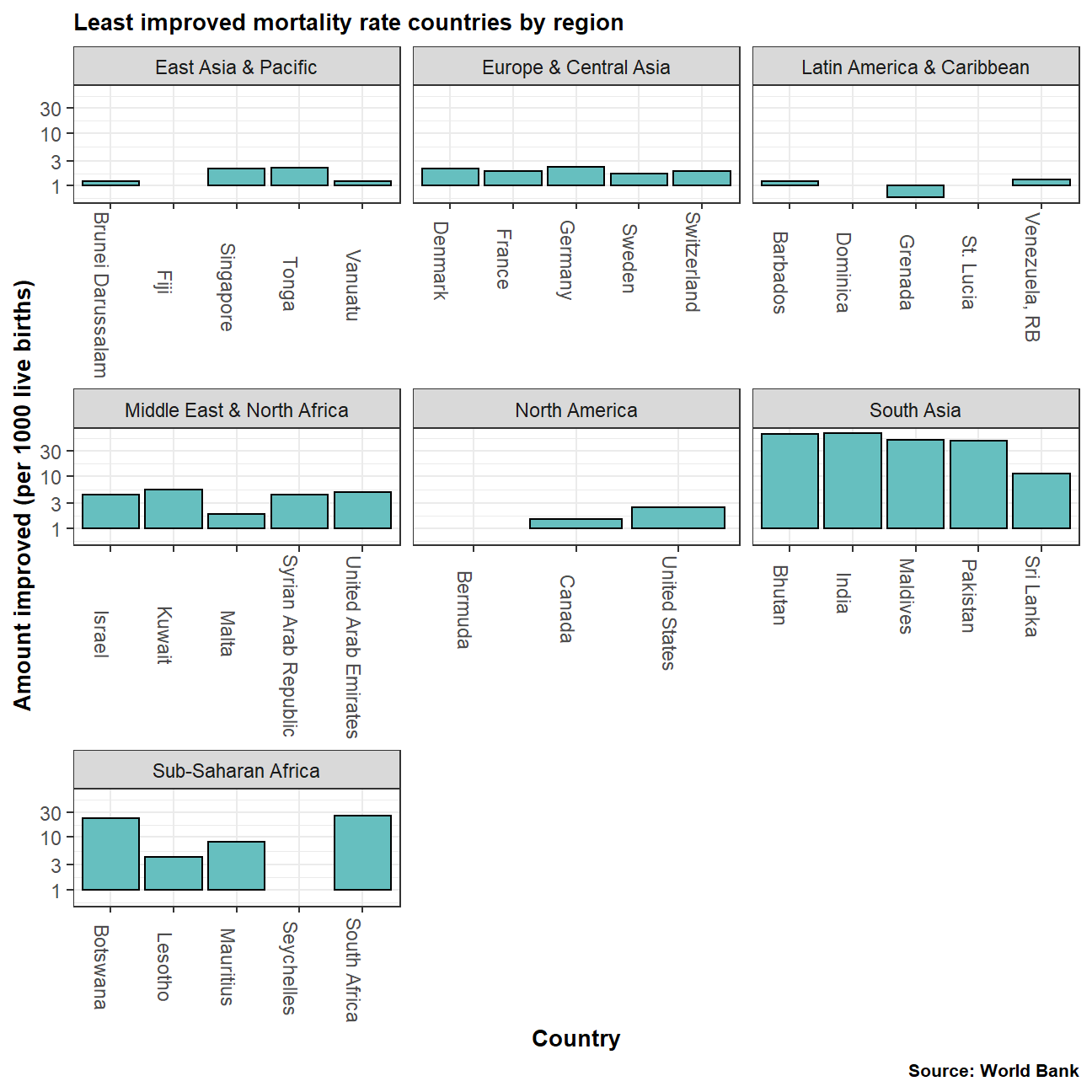
Is there a relationship between primary school and fertility rate?
# Is there a relationship between primary school enrollment and fertility rate?
primschool_fertility <- select(worldbank_data, prim_school_enroll, fertility_rate)
#Generate a scatterplot with a smoothing line to report your results. You may find facetting by region useful
ggplot(primschool_fertility, aes(x=fertility_rate, y=prim_school_enroll)) +
  geom_point(alpha=0.15) +
  labs(title="How likely is it that a child goes to primary school?",
       subtitle="Comparing the amount of children with the chance of attending primary school ",
       caption="Source: World Bank",
       x="Fertility Rate (babies per woman)",
       y="Children attending primary school (%)") +
  geom_smooth() +
  theme_bw() +
  theme(plot.title = element_text(face = "bold", size = 10)) +
  theme(plot.subtitle = element_text(size = 8)) +
  theme(axis.title.x = element_text(face = "bold", size = 10)) +
  theme(axis.title.y = element_text(face = "bold", size = 10)) +
  theme(plot.caption = element_text(face = "bold", size = 9))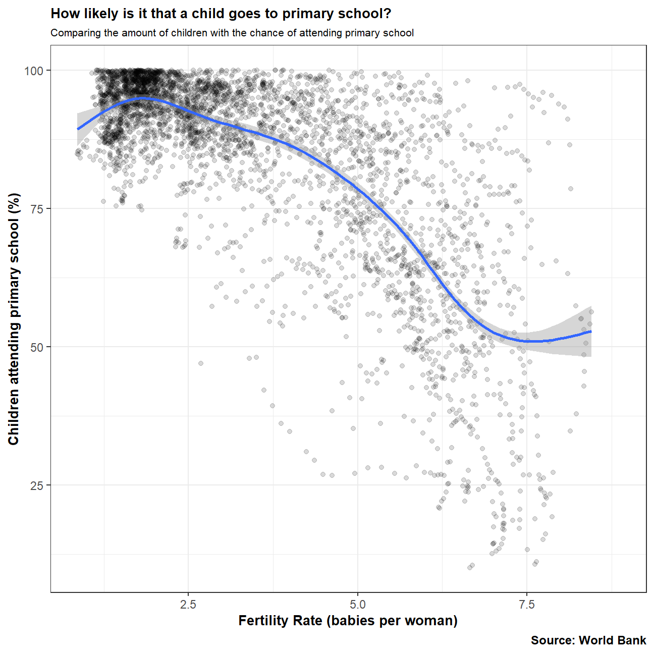
The graphs shows its is more likely for children to go primary school in countries where the average amount of children is lower. This could be due to various reasons, including cost of education or the chance that mothers with less children could be more likely to also hold full time job,.
Data from:
- Life expectancy at birth (life_expectancy_years.csv)
- GDP per capita in constant 2010 US$ (https://data.worldbank.org/indicator/NY.GDP.PCAP.KD)
- Female fertility: The number of babies per woman (https://data.worldbank.org/indicator/SP.DYN.TFRT.IN)
- Primary school enrollment as % of children attending primary school (https://data.worldbank.org/indicator/SE.PRM.NENR)
- Mortality rate, for under 5, per 1000 live births (https://data.worldbank.org/indicator/SH.DYN.MORT)
- HIV prevalence (adults_with_hiv_percent_age_15_49.csv): The estimated number of people living with HIV per 100 population of age group 15-49.