Analysis of rental data from TfL bike sharing
Excess rentals in TfL bike sharing
In this assignment, we analyse the data from TfL bike sharing in the city of London, UK. We wish to determine any significant patterns in our data set, study any cyclicality or anomalous observations.To do so, we begin by downloading the data set from the link below.
#Obtaining the data set from Tfl's website
url <- "https://data.london.gov.uk/download/number-bicycle-hires/ac29363e-e0cb-47cc-a97a-e216d900a6b0/tfl-daily-cycle-hires.xlsx"
# Use read_excel to read it as dataframe
bike0 <- read_excel(bike.temp,
sheet = "Data",
range = cell_cols("A:B"))
# change dates to get year, month, and week
bike <- bike0 %>%
clean_names() %>%
rename (bikes_hired = number_of_bicycle_hires) %>%
mutate (year = year(day),
month = lubridate::month(day),
week = isoweek(day))Creating distribution of bikes hired per month
Over here, we create distribution of bikes hired on a monthly basis for the period 2015 - 2020.
bike1 <- bike %>% filter(year>2014)
month.labs <- c("Jan","Feb","Mar","Apr","May","Jun","Jul","Aug","Sep","Oct","Nov","Dec")
names(month.labs) <- c("1", "2", "3","4", "5", "6","7", "8", "9","10", "11", "12")

plot_month_year <- ggplot(bike1,aes(x=bikes_hired))+
  geom_density(size=0.75)+
  facet_grid(cols=vars(month),rows=vars(year),labeller=labeller(month=month.labs))+
  theme_bw() +
  scale_x_continuous( breaks = c(20000, 40000, 60000),labels = c("20k", "40k", "60k"))+
  labs(y='', x='Bike Rentals', title='Distribution of bikes hired per month')+
  theme(title = element_text(size=26, face ="bold", hjust=0.5),
        axis.text.y = element_blank(),
        axis.title = element_text(size=20, face = "bold"),
        axis.text = element_text(size=14),
        axis.ticks = element_blank(),
        strip.text = element_text(size=18),
        panel.border = element_blank(),
        strip.background = element_rect(color="white", fill="white", size=1))
plot_month_year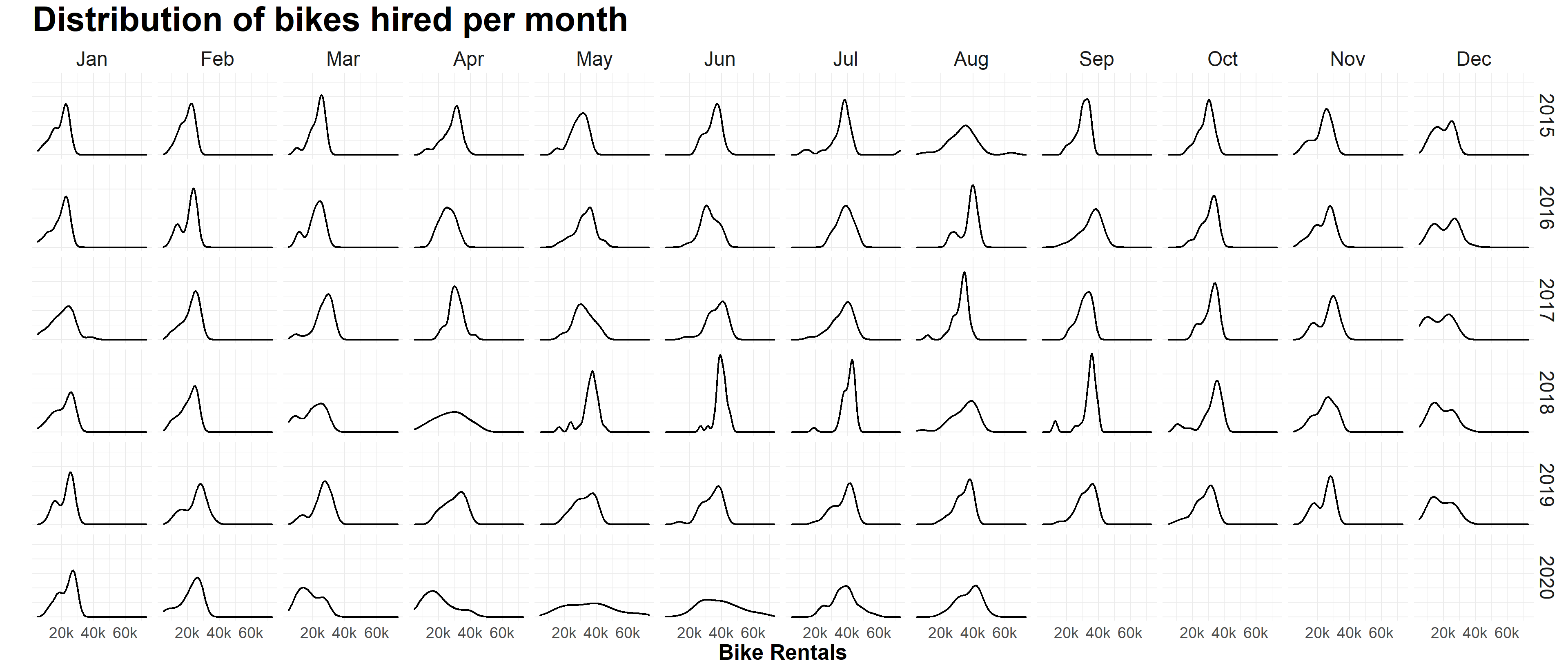
When look at the density plots of May and Jun in 2020, we can easily notice that their peaks are lower than the peaks of the same month of the previous year, which implies that the bike rentals are less concentrated in these two month. People rent bicycles more frequently on some days and rent bicycles less often on certain days. The possible reason is that covid-19 has changed people’s lifestyles. Some people may rent bicycles more often to do some exercise and some people may be afraid of getting out of their bedrooms thus rent bicycles less often.
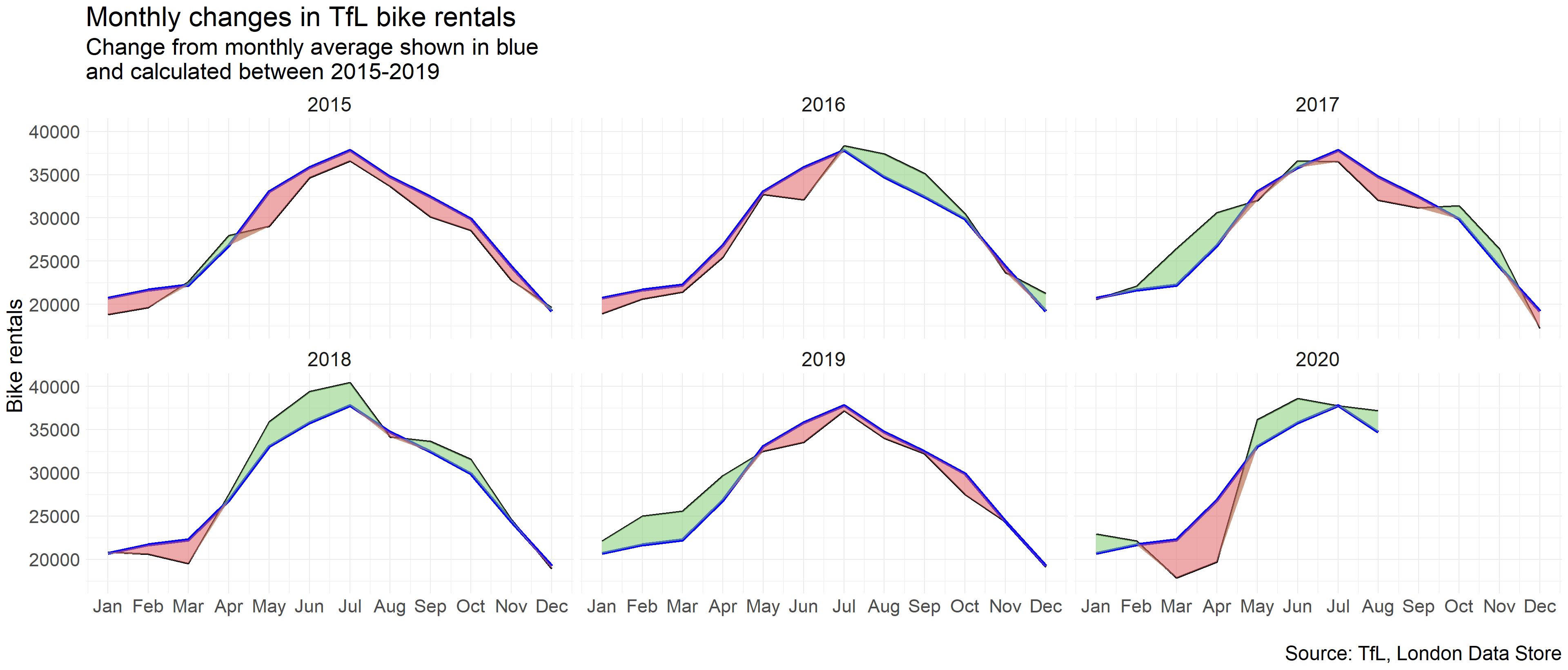
Reproduction of monthly changes in TfL bike rentals
Reproduction #2 Over here, we plot the average monthly change in tfl bikes using ggplot. We also using the geom_ribbon function in ggplot to create a average band around our data trend line.
Reproduction of weekly changes in TfL bike rentals
The reproduction below looks at percentage changes from the expected level of weekly rentals. The two grey shaded rectangles correspond to the second (weeks 14-26) and fourth (weeks 40-52) quarters.
The plot that we replicated is shown as below:
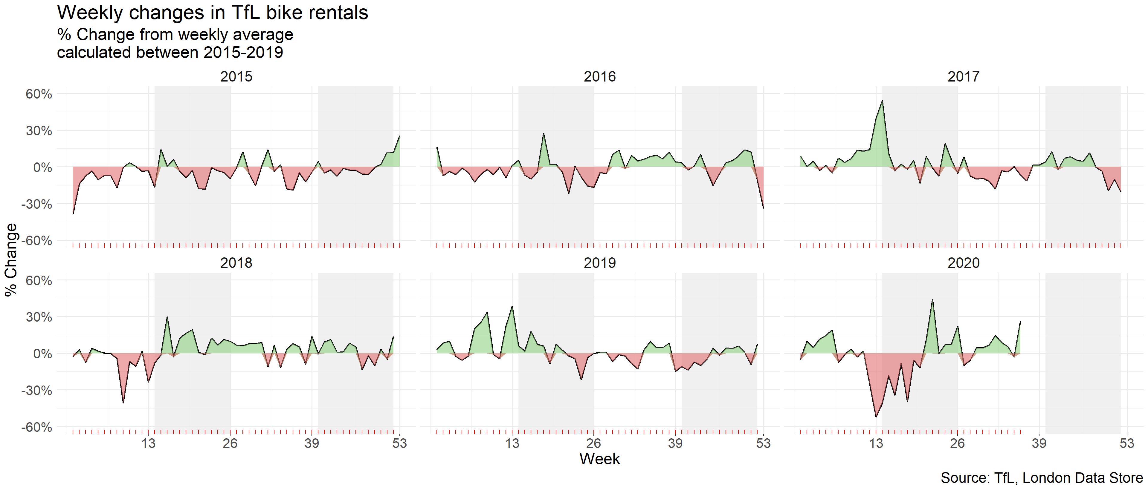
When calculating the expected rentals, we should use the “mean” because “mean” reflect the average number of the data. But the “median” is just the “middle” value in the list of numbers. Based on our findings, there is a spike in usage of bikes in 2020 which corresponds with COVID-19 lockdowns and people finding leisure activities to occupy themselves.